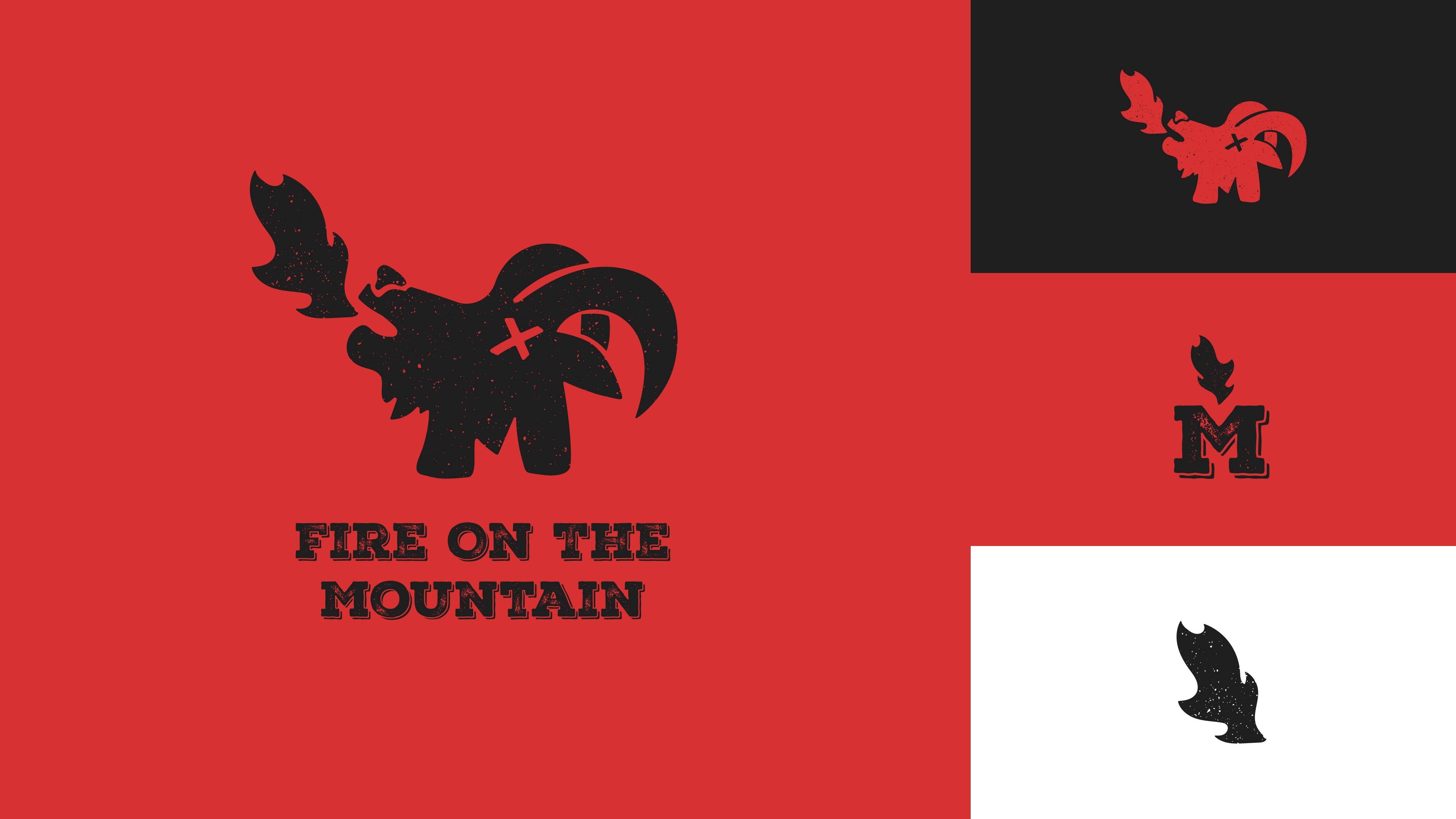
Fire on the Mountain is a hot wings spot located in Portland. It has a tactile feel and leans into its local flair. The refresh was meant to give it a more streamlined feel while still feeling tactile and local.
To achieve this, I created a bold and dynamic logo. The icon is bold and the flame-like elements add a sense of energy and excitement to the brand. I wanted to keep elements of distress on the logo to make it feel more tactile. The refreshed Fire on the Mountain logo is a perfect representation of the brand's commitment to quality and flavor. It is sure to attract a wider audience and help the brand compete with other established chains.


