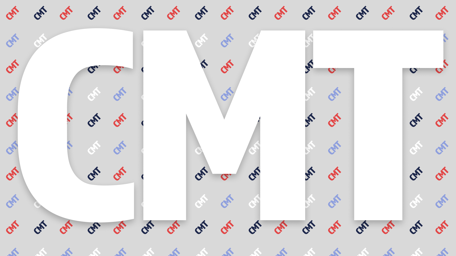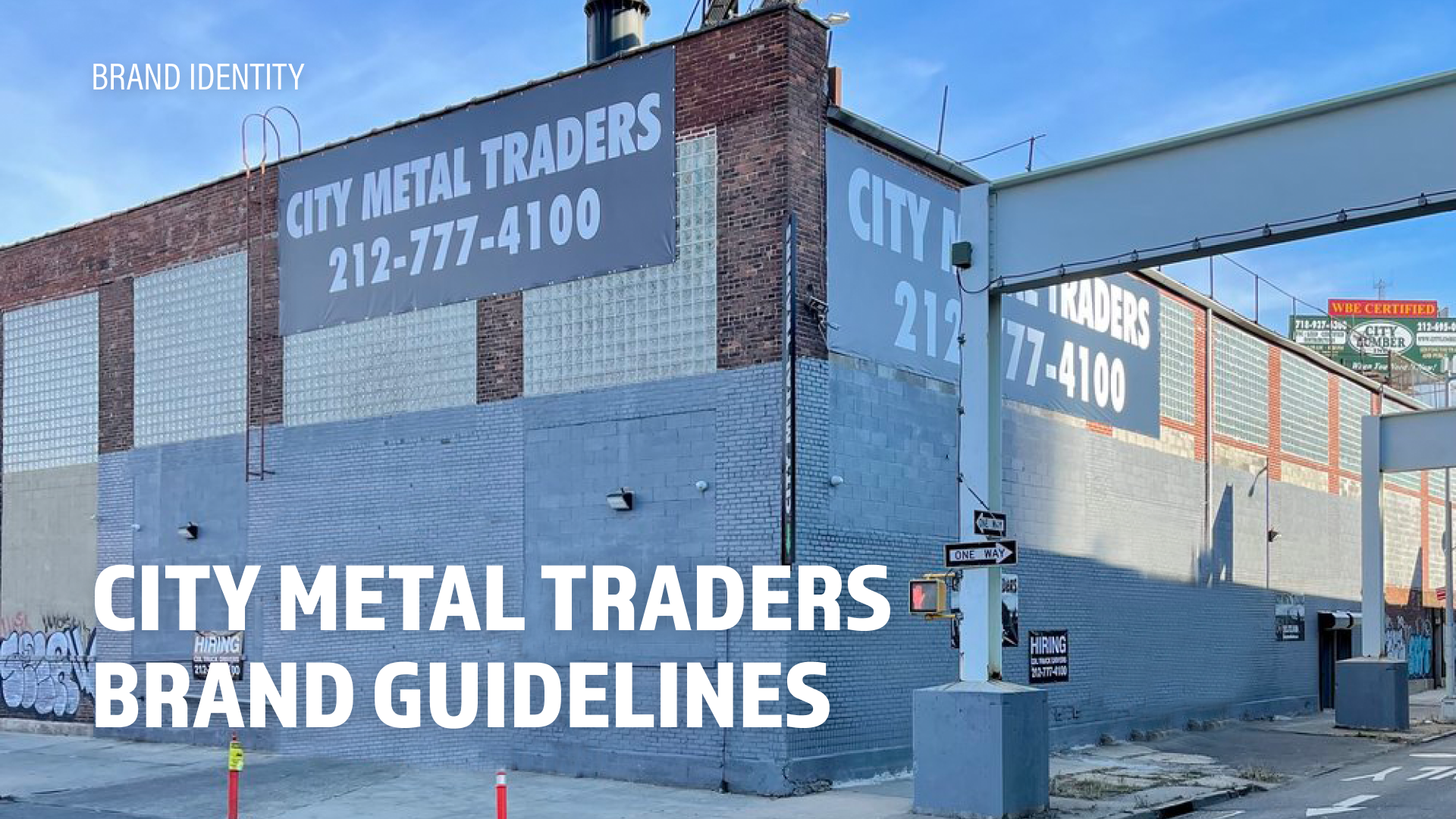
The goal of this project was to refresh the logo of City Metal Traders while maintaining the brand's core values and history.
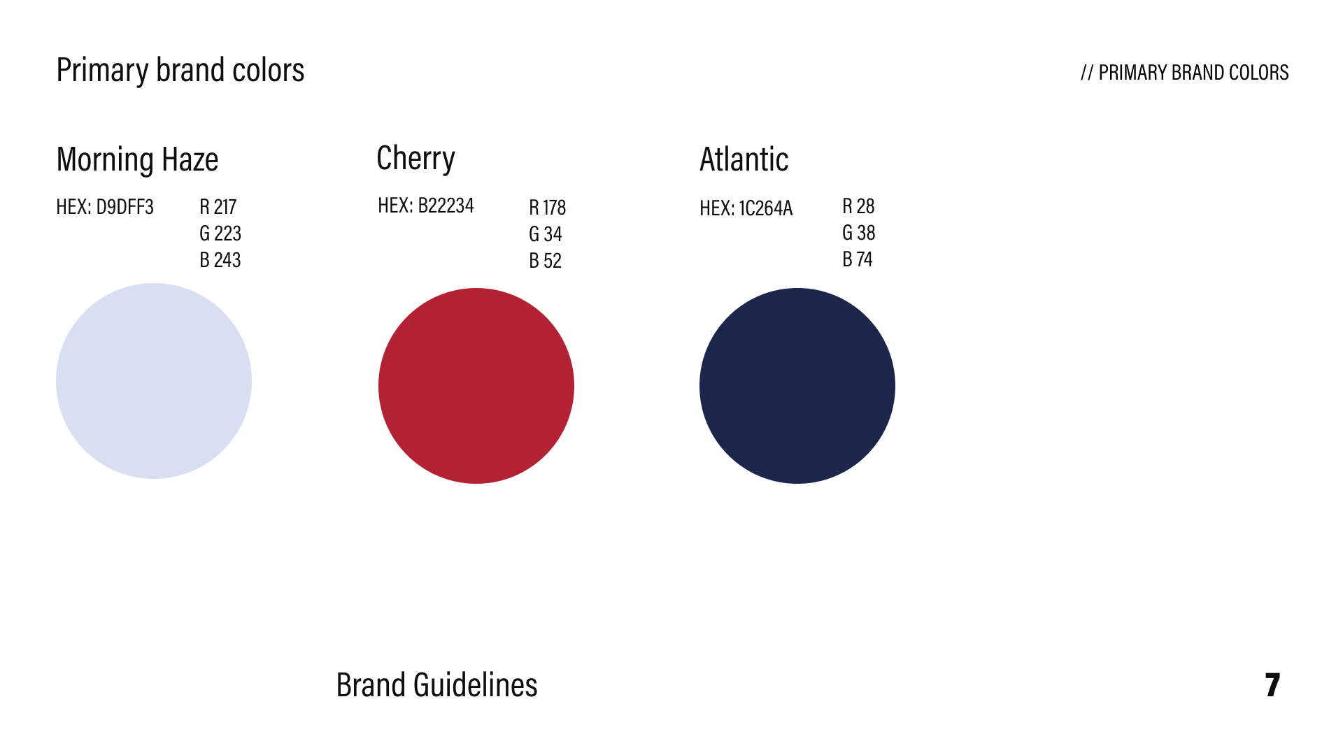
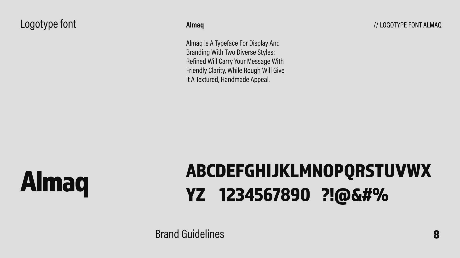
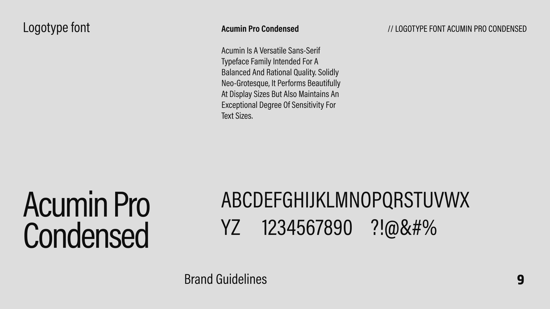
The client wanted a more elegant font than Impact and a simple brand guideline that could help to center their brand identity and vision. The new design should incorporate new colors into their brand system and develop a recognizable acronym logo mark.
